Horizontal type tool:
On the face of it the type tool would seem to be a plug and play tool. Just click the big T icon and start typing. This of course will work, but it is worth understanding the basic and advanced options available to you so you can have maximum control over your typography.
Basic options:
From left to right here are the basic options available to you.
- Change the text orientation
- This changes the text from horizontal to vertical.
- Font family
- This is a drop down menu of all the fonts currently active on your system. I recommend using some Font Management Software to keep things manageable. I use FontExplorer X.
- Font style
- This is whether you choose the regular, bold or italic version of your font face. Whether these options are available depends on whether you have all font styles of a particular font.
- Font size
- This defines the font size. A useful trick is that you can hover over the TT icon and drag left and right. Alternatively you can use the dropdown or type the number you want directly into the box.
- Anti aliasing
- This defines how you want your text to be anti-aliased. There are five options. See the image below for the effects this creates.
- Left, right and centre align text
- These align the text according to the text box you have drawn.
Warping text:
Just to the right of the main options is the Warp Text option. Typographers cringe at the thought of have their lovingly crafted typefaces warped like this. I'm not a big fan but just incase you need it here's how it works. Select the text you want to warp and then click on the warp button. This brings up an option box with a dazzling array of options. Have a play yourself to explore all of the options available to you.

The Character Tab - fine-tuning typography
If you want total control over your typography in Photoshop shop you will need to open the Character and Paragraph tabs. They give you precision control over type. Some of the options are repeated from the basic options. Let's start with the Character tab. You will find the character tab icon to the right of the warp icon. Or you can open it by going to Window > Character.

- Font family
- This is a drop down menu of all the fonts currently active on your system.
- Font style
- This is whether you choose the regular, bold or italic version of your font face.
- Font size
- This defines the font size.
- Leading
- This is also known as line spacing. This is the distance between the lines of text.
- Kerning
- This is the relationship between particular letters. Most digital fonts do this for you but can override this. For more info see Wikipedia.
- Tracking
- This is similar to kerning but applies to text as a whole rather than relationships between individual letters.
- Vertical scaling
- This lets you scale text vertically. Again if you hover over the icon you can drag to resize.
- Horizontal scaling
- This lets you scale text horizontally. Hovering over the icon you can drag to resize.
- Baseline
- If you want to move text above or below the baseline you can do it with this optoin.
- Color
- Sets the color of the text
There are a number of text formatting options after this. A useful one for web design is the underline option which lets you underline links in designs. The language and aliasing options are also available here.
The Paragraph Tab - Formatting text:
Finally the Paragraph tab lets you position blocks of text as you wish. The first row of optoins give you full control over aligning blocks of text. You can left, right and centre align or choose to justify your text.

- Indent left margin
- This moves text away from the left edge
- Indent right margin
- This moves text away from the right edge
- Indent first line
- This indents the first line of the text only
- Add space before paragraph
- This shifts text down from the start of the paragraph
- Add space after the paragraph
- This adds padding after the paragraph has finished
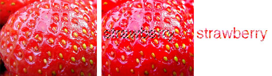
Type Mask Tools:
The text tool offers the mask tools to allow you type your text as if it were a selection. Then you can either fill it or apply an effect as you wish. Or you can copy the selection and paste it. In the example below I've used it on the strawberry to generate text with the background of the strawberry. A simple trick that can be very effective.